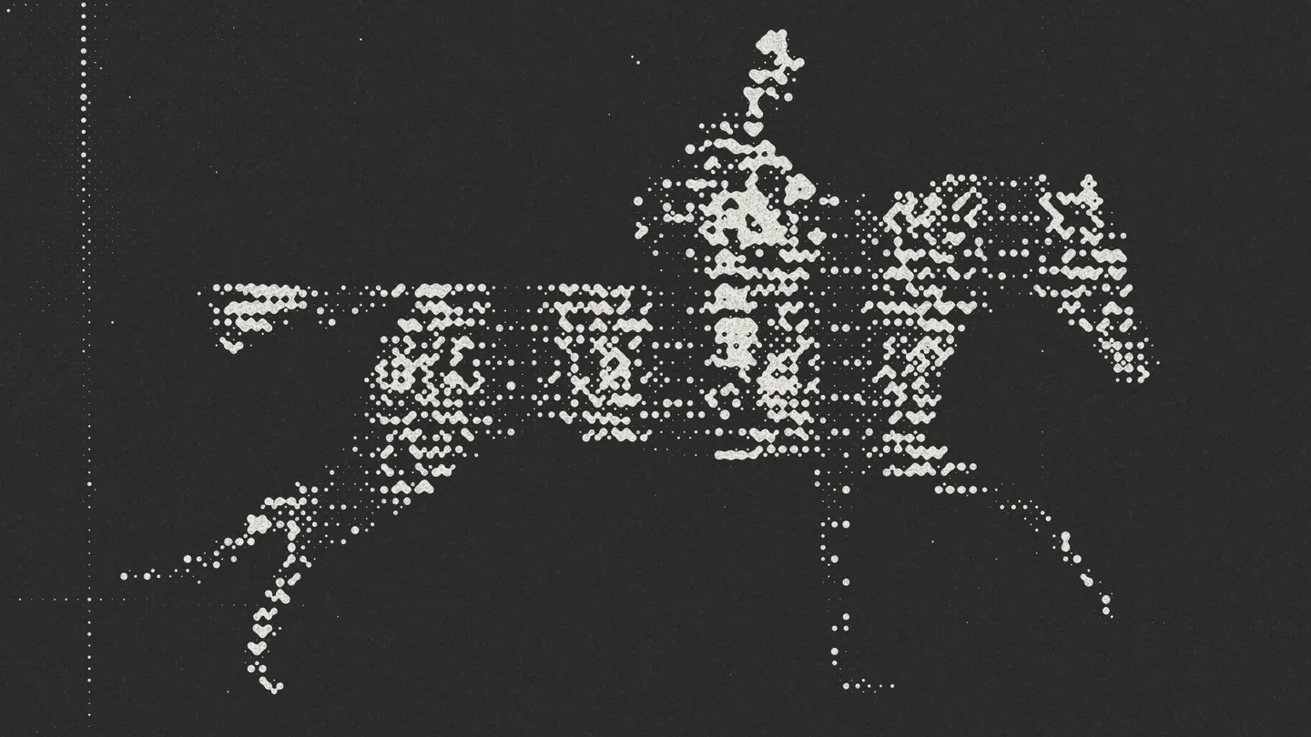
In September I gave the 3D objects on my desk at heyhaigh.ai a retro look: warm lighting, chunky 128-pixel textures, an ordered dither and a few subtler layers. Each one is easy to miss on its own, so I made a video that pulls the look apart, one layer at a time.
It became "Layer Breakdown", a 74-second film in the style of a 1950s educational print. Claude Code built it in Mirage Tesseract while I directed with references, notes and a lot of "a little tighter". The heart of this write-up is how I used Tesseract with Claude Code: reviewing frames before rendering anything, and cutting the film into scenes that export in seconds.
Watch It First
The running order, as it appears on the plate's contents page:
- Fig 1, the evidence. Two real desk photos, printed and taped down.
- Fig 2, the statics. Images generated in Plnty from those photos, then cut out.
- Fig 3, the model. Higgsfield, inside ChatGPT, turns two statics into one GLB.
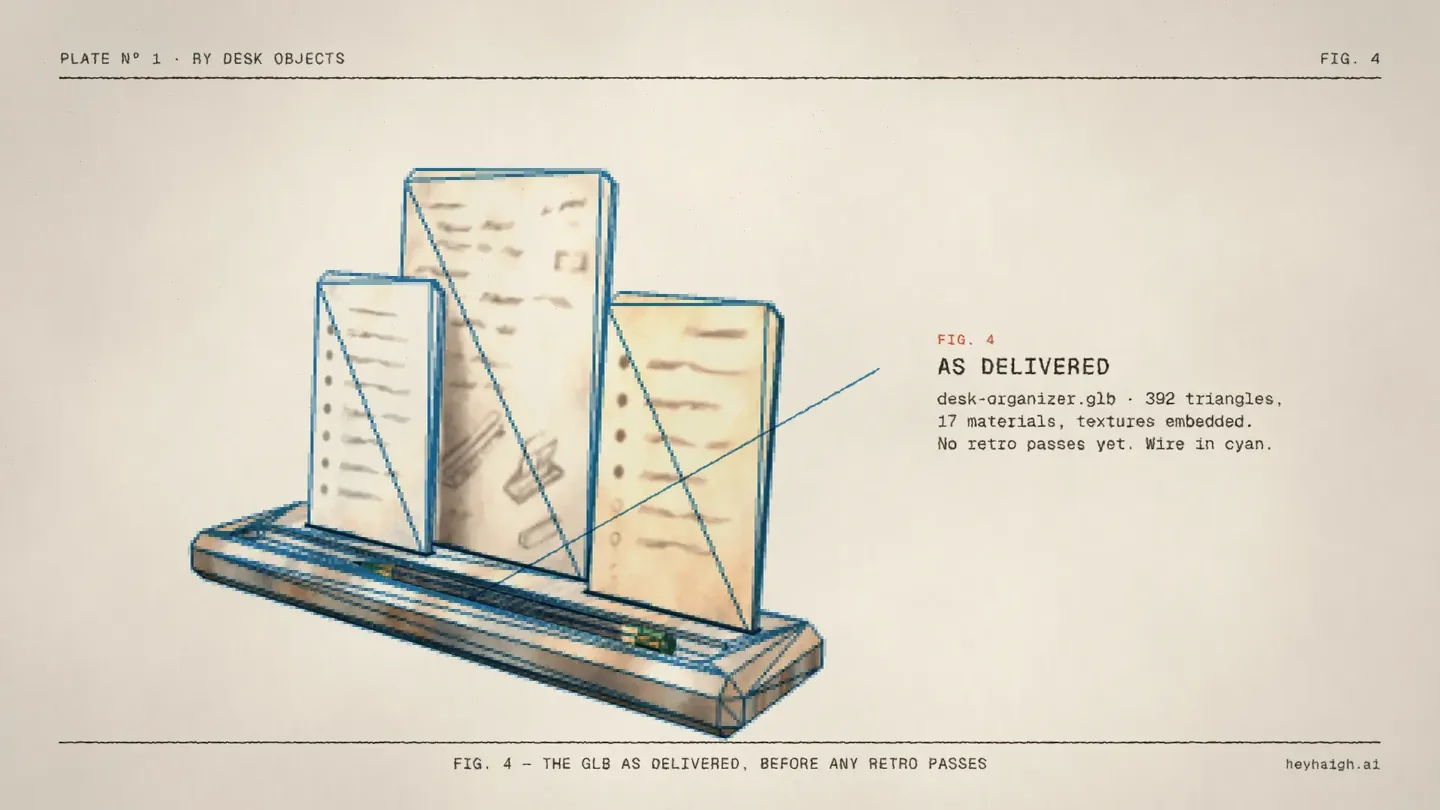
- Fig 4, the GLB as delivered. The raw model before any retro passes.
- Fig 5.1–5.7, the lamp's seven passes, then Fig 5.8, all seven as a stack.
- Fig 6, the pennant. A sine field, shown at ×6, then as shipped.
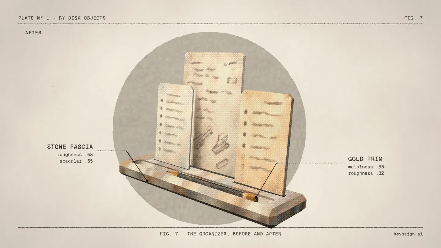
- Fig 7, the organizer. Before and after, with two material callouts and its backdrop.
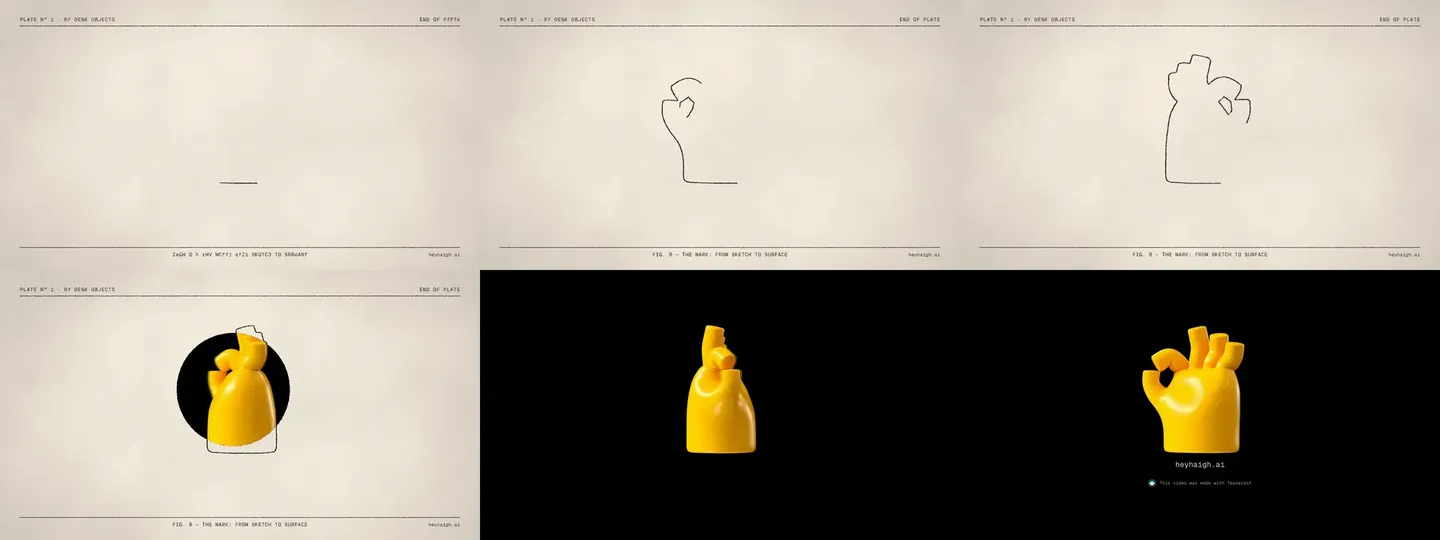
- Fig 8, the mark. A line sketch of my hand logo draws itself, spins, and becomes the 3D hand.
Try Tesseract yourself
Everything in this video was built with Mirage's Tesseract, driven by an AI agent. You can set it up in ChatGPT or Claude with one prompt, which is further down.
Why a Printed Plate
The first version didn't look like this. Earlier the same day I'd made a "Latest Updates" promo for the site in its usual clean style, and the first cut of this one followed suit: a Python compositor laid dark callout pills over the renders. I liked it. I reviewed it on my phone and said I'd send notes later.
When I came back, the notes were really one note. I sent four photos of 1950s and 60s printed ephemera and asked for that quality instead:
"Everything had this sort of quality and characteristic to it that felt like ink was pressed into paper. It didn't necessarily have the hardest lines … as if it was on paper, on a blueprint. … I want any sort of inclusion of line work and arrows to be intentional. They should point to specific things. They should not feel gratuitous."
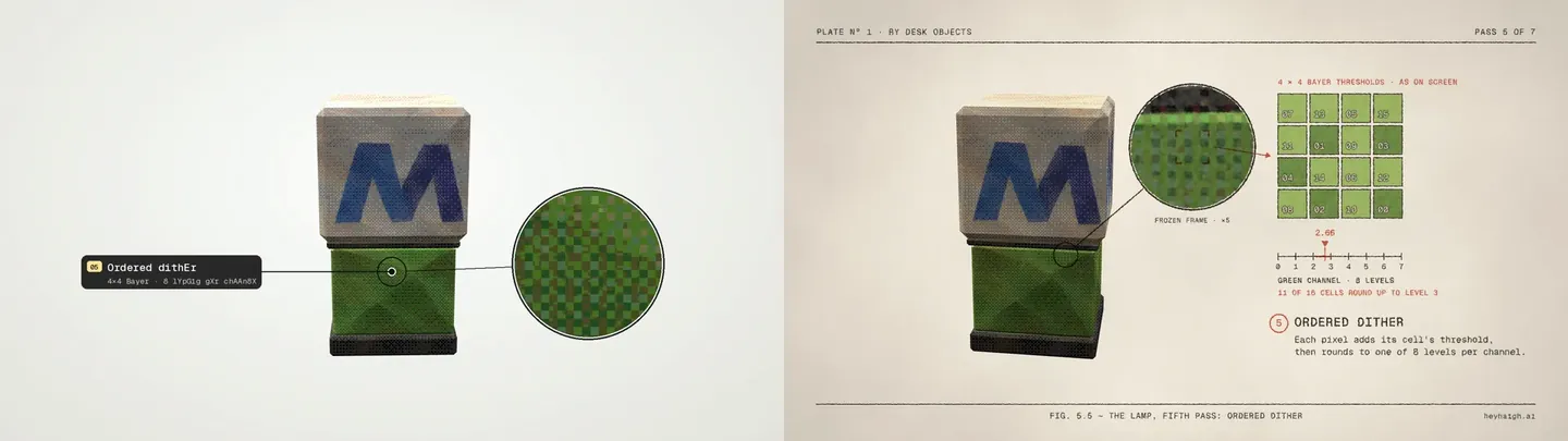
That last sentence became the rule for the whole video: every line points at something real. A leader ends on the actual enamel it describes. An arrow carries a real 4×4 block of pixels to the matrix that produced it. If a mark doesn't connect two true things, it doesn't go in.
Claude read the four references for shared traits and proposed a short grammar: cream stock and pressed ink, blueprint conventions (dimension lines, dashed guides, dots with leaders), limited spot colour (warm black, cyan for measurement and registration, red for the thing under discussion), and Geist Mono for all type, as on the site. Before animating anything it rendered three style frames straight from the real Tesseract project, so I was approving the actual look, not a mockup.
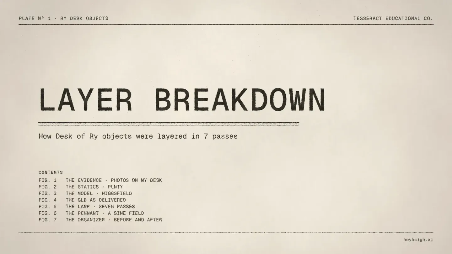
One deliberate departure from the house style: the first promo's title used hand-kerned mixed case. Here the title is set in letterspaced capitals, which suits a printed plate better.
How I Used Tesseract With Claude Code
This is the part I'd most want to steal for the next video. The visuals matter, but the workflow is what made over a minute of dense, annotated motion reviewable in an evening, mostly from my phone.
Who does what
Tesseract is Mirage's motion editor, made to be driven by agents. It edits and composites layered projects, but it doesn't generate footage, which suited this video: every picture came from my files or the site's own renderer. Claude Code worked through Tesseract's skills and its local tsrct command-line tool (version 0.3.0). I never dragged anything around a timeline. I wrote notes, sent screenshots and approved things.
Claude's side of every change was the same three moves:
- Patch the builder. The whole video is one Python script. It writes Tesseract's editable JSON document, layer by layer, plus a list of keyframe actions. (The first print version had 265 of them.)
- Commit and apply.
tsrct project commitloads the document into the project, andtsrct project applyadds the keyframes. - Export.
tsrct exportrenders the MP4 at 1080p and 60 fps, and, at the end, a 4K master of the same edit.
Every visible element is a native layer: video and image layers for footage and prints, shapes for lines, rings and arrows, text for type, and groups, mattes and adjustment layers to hold it together. Lines draw on like a pen by animating a path's trim. Text shuffles in with the site's own rule (characters swap 30 times a second, each unresolved one has a 70% chance of showing a random letter or digit, and they resolve left to right), written as a run of text keyframes. Track mattes do the reveals. And every version builds from a clean base document, so stale keyframes never survive a rebuild. Because it's all native and generated, any line, label or timing can still be changed later, by code or by hand.
Review before rendering
Almost nothing was judged from a finished export. After the style frames, review ran on frames:
- Contact sheets. Frames sampled across the whole timeline and tiled into one image. Claude read these itself after every build to catch collisions, broken scenes and continuity slips before I saw anything. One caught a broken Fig 3 halftone before an hour-long export started.
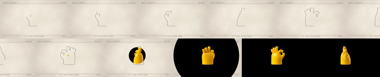
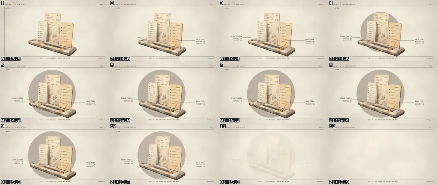
- Frame-by-frame sequences. When a note was about timing, I got a strip of frames a fraction of a second apart instead of a new video: the Fig 7 backdrop growing in, or the hand going from drawing to spin at 4 frames a second.
- Screenshots back. I'd scrub a phone-sized preview, screenshot the exact moment and send it with a note. For the hand, the note was simply where the spin should start, and Claude matched the screenshot to 56% of the outline drawn.
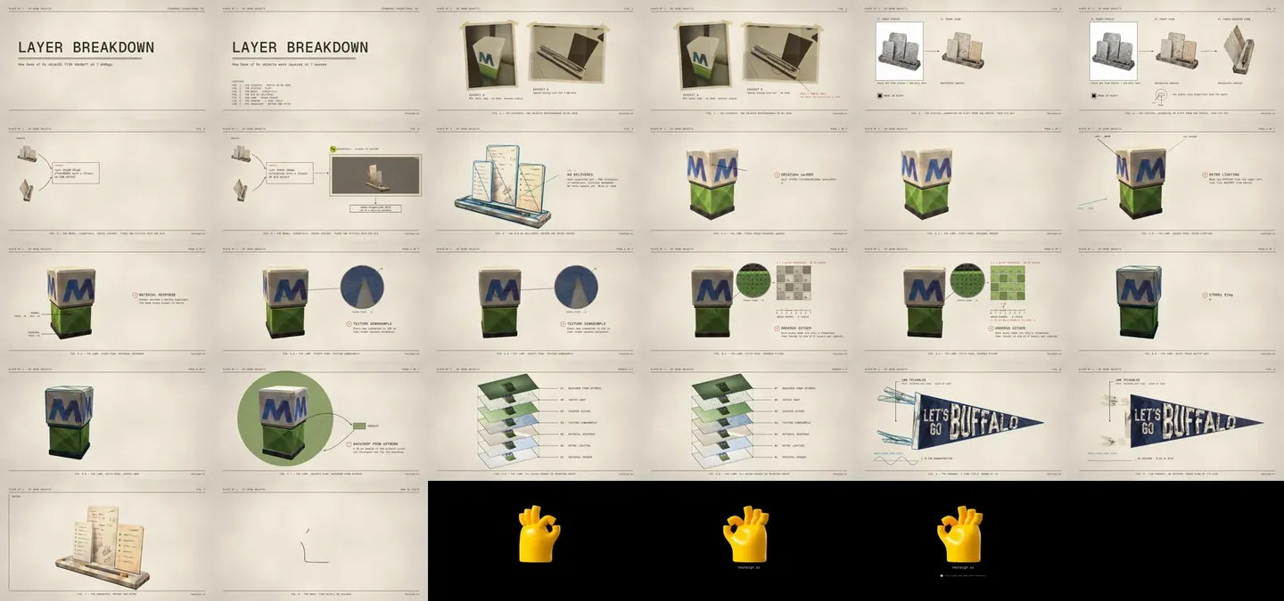
Some of my notes, to give a sense of the grain:
- Turn up the paper texture so the creases show, vary the tape angles so they're not identical, and put the tape on top of the photos.
- Make the Higgsfield recording more legible, and let its logo fill the badge to the edge.
- Tighten Fig 4 and Fig 5.1–5.7 slightly. Each was hanging a little too long.
- Grow the Fig 7 backdrop in closer to the stone fascia callout, but keep it after both callouts, then trim the hold.
- Make the Tesseract badge's outer ring very subtle. Let's say 15%.
Break the film into scenes
The biggest unlock came late. A full export of the film (88 seconds at the time) took 1 hour 40 minutes. But any single scene can be cut out into its own short, standalone Tesseract document and exported on its own in roughly 8 to 20 seconds. The previews are full 1080p at 60 fps. They're fast because they're short and isolated, not because they're lower resolution.
That was my ask once the end scene got complicated:
"Let's do one isolated export of the final scene … because I think that's probably the other one that's the most complicated right now. Once that's signed off, we can do the whole render."
It went through three versions:
- Rebuild one scene. The first tool,
preview_scene.py, imports the same builder, moves one scene to the start of a short document, adds the page header and caption, and writes it to a separate preview project. The Fig 7 preview rendered in about 8 seconds. - Slice it from the master. The second,
slice_scene.py, cuts any scene straight out of the finished master document, with a little padding on each side. Layers that straddle the cut are trimmed, and their keyframes are re-based, with each animated value evaluated at the cut so nothing jumps. The scene keeps its real header, caption and sound-effect layers. A preview is exactly what the final recut will contain, because nothing is rebuilt by hand. - Preview a run of scenes. A third script slices two or more neighbouring scenes out together. Pacing only shows up across a cut: every scene had been approved on its own, but watching the title run into Fig 1 I asked for about a second off each of the first three scenes, then half a second more, then for the title and Fig 1 to land at four seconds each. Three rounds, each a preview of a few scenes instead of a full export.
The loop became: I give a note, Claude patches the builder, exports that one scene, sends it to my phone, I approve it, and we move to the next. The main project file is never touched by a preview. The hour-plus master export only runs once every scene is signed off.
Why the full export is slow
An 8-second preview against a 100-minute export didn't add up, so Claude measured it. The full export ran at about 0.8 seconds per frame on a single CPU core. The cause was the text shuffles: roughly 1,900 text keyframes, and every one costs time on every frame, even on text that isn't on screen.
| Same 6-second slice | Render time |
|---|---|
| With every text keyframe in the document | About 5 minutes |
| With no text keyframes | 42 seconds |
The page header and captions alone (about 490 of those keyframes) added 96 seconds to that slice on their own. Dropping consecutive duplicate keyframes is lossless and saved about 5%. A real fix would be fewer shuffle steps, or rendering chunks in parallel, which risks visible seams. Scene isolation sidesteps the problem for review, because a sliced scene only carries its own keyframes. The 4K master confirmed the diagnosis: it took 1 hour 45 minutes against 1 hour 7 minutes for the same edit at 1080p, about 1.6 times longer for four times the pixels, because the text-keyframe cost doesn't depend on resolution. It also made good feedback for Mirage: the CLI is silent during a long export, so an agent can only estimate progress. Machine-readable progress events would help.
The same loop runs the sound
The sound-effects pass runs on exactly this loop. A single script regenerates one scene's sound from the animation's own keyframes, imports it, adds every approved sound to a copy of the master, slices that scene out and exports it in about 20 seconds. More on the sounds below.
Real Inputs, From My Desk to a GLB
The first cut only covered the seven render passes. Watching it, I realised it skipped the half of the story that came first: how the 3D objects were made at all. So I sent the actual process files and the video grew a chapter. Nothing in it is a mockup.
Fig 1: the evidence
Two photos I took of the real objects on my desk: an MTA table lamp and an Ugmonk analog card bar. They're printed as four-ink halftone photos on cream paper, using Paper's HalftoneCmyk shader (its Vintage preset, softened) with a PaperTexture layer for fibres, folds and creases. Those were rendered once as stills, then taped into the plate with tape strips that sit on top of the prints at different angles. A red ring marks the card bar's rail and pencil well: "the shape the statics had to keep".
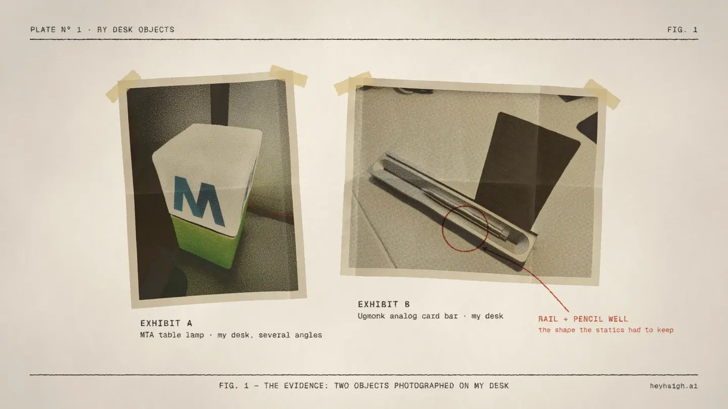
Fig 2: the statics
From those photos (plus some low-poly references) I generated static images in Plnty, then used Plnty's background removal to get clean cutouts. The plate shows all three: the first static still on its white generation backdrop, so it's obvious nothing has been cut out yet, then the front and three-quarter views with cyan dashed cut lines traced from the real cutout edges. A small plan diagram explains why there are two angles: they help the 3D step read the depth.
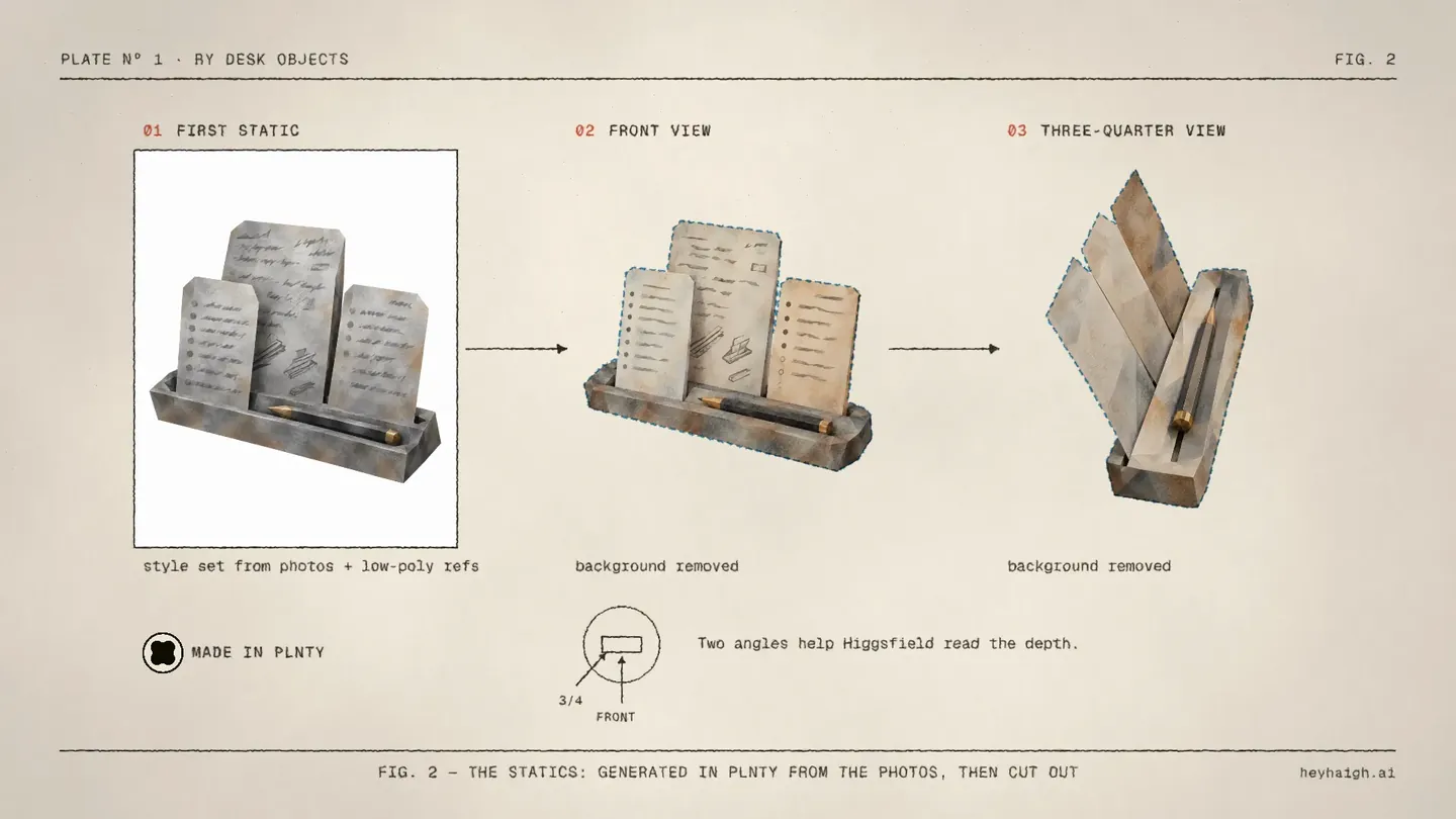
Fig 3: the model
The two cutouts went into the Higgsfield plugin inside ChatGPT with the prompt I actually used: "turn these image references into a single 3D GLB object". My screen recording of the result plays in the plate, printed through a custom CMYK halftone shader so it reads like the photos. The output was desk-organizer.glb, 412 KB with its textures embedded. That's the same file the site loads today.
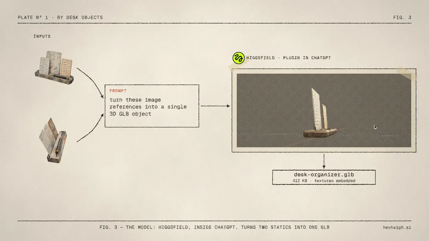
Fig 4: the GLB as delivered
Then the raw model turns on the page with a cyan wireframe: 392 triangles and 17 materials, with no retro passes yet. That's the handoff to the lamp, where the passes are easiest to see.
The Site's Own Shader Renders Every Pass
The passes aren't screen recordings, and they aren't recreations. Claude built a small harness: the site's actual desk-object viewer, loading the real GLBs and the exact lighting, texture and shader code from components/desk-objects/viewer-source.js, with every layer switchable on its own. Playwright drives it and renders frame-exact PNGs.
- One camera path for every state. Each pass of an object renders on the same orbit, frame for frame, so any two states line up perfectly for a wipe or a matte.
- The real "before". The original state comes from the pull request's diff: white studio light from the right, full-resolution smooth textures and a pale backdrop.
- Tracking data. The harness also logs the screen position of named model parts on every frame, like the lamp's ivory top or the organizer's gold cap. Callouts are pinned to those points, so a leader ends on the enamel even while the lamp turns.
- Rendered long enough. As scenes got slower to give the annotations time to read, the footage was re-rendered longer rather than looped. The final lamp orbit is 36 seconds.
Those clips are rendered on white and multiplied onto the paper, so the stock shows through the lamp like an inked plate.
Seven Passes on the Lamp
The lamp is the cleanest example: 176 triangles and six materials. Each pass prints over the previous one behind an inked roller wipe, gets a numbered callout, and a figure caption at the foot of the page. The values in the callouts are the ones in the viewer code.
The lamp chapter was the last thing retimed. After the first full master, I asked for the passes to move faster: most lost about a second, the texture pass about a second and a half, the Bayer pass half a second, all snapped to the same timing grid as the rest of the film. The chapter now runs about 25 seconds. Three short rounds on the transitions then trimmed the title, the first four figures and the stack, and the film landed at 74 seconds. I also asked for the lamp's leader lines to draw from the text to the object, so your eye follows the label to the thing it names.
- Original render. The glTF model with full-resolution textures under white studio light from the right.
- Retro lighting. A warm key,
#FFF1D9, from the upper left and a cool fill,#DCE8FF, from behind, over a sky/ground hemisphere light. A dashed arrow shows where the old key came from. - Material response. The enamel gets roughness .30 and specular .85, so it catches a moving highlight. The charcoal base stays closer to matte at roughness .48.
- Texture downsample. Every texture is resampled to 128 px (256 px on the pennant) and drawn with nearest-neighbour filtering. A ×4 loupe sits on a measured stair-step edge on the blue M.
- Ordered dither. A 4×4 Bayer dither to 8 levels per channel, applied after lighting. More on this one below.
- Vertex snap. While the camera moves, projected vertices land on a 1.25 CSS-pixel screen grid. A cyan wireframe shows the mesh.
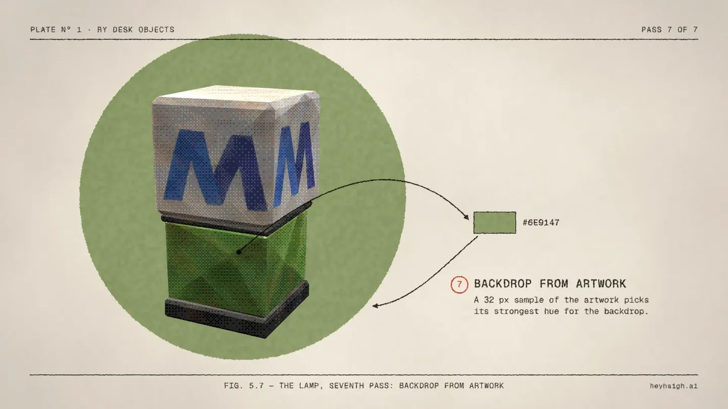
- Backdrop from artwork. A 32 px sample of the artwork picks its strongest hue,
#6E9147for the lamp. An arrow runs from the enamel to a swatch, then to a green plate printed behind the lamp.
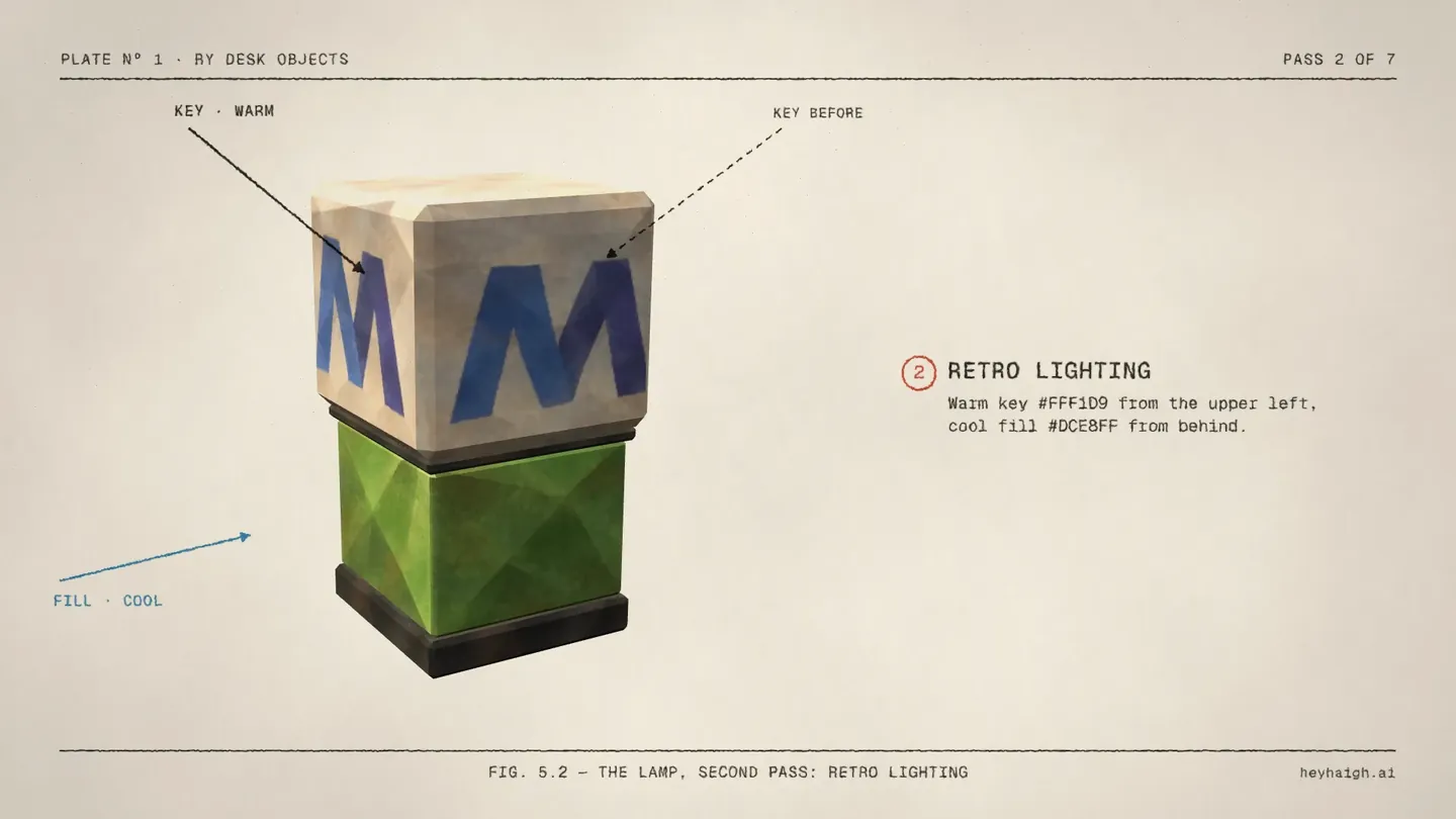
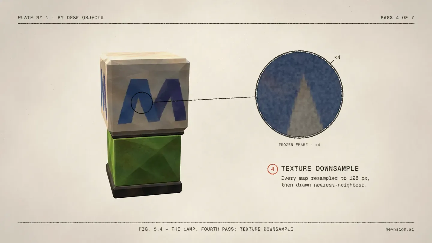
Two details from my notes made the loupes feel printed rather than digital. Magnified pixels that sit perfectly still look like a screenshot, so I asked for some life in them. They now "boil": a custom shader re-settles small cells 12 times a second, like hand-inked animation. And in Fig 5.7, the first version flooded green over the whole lamp. It reads as a backdrop now because the green plate prints behind it, and a silhouette matte keeps the lamp clean on top.
The Bayer Matrix, Checked Against the Shader
Halfway through, I saw a keyframe from a different attempt at this video. Its style missed, but it had a great idea: show the 4×4 Bayer matrix behind the dither. My condition was simple: if it isn't accurate, we don't say it.
It's accurate. The site's fragment shader runs after lighting and the sRGB conversion, finds each pixel's place in a repeating 4×4 cell, and builds the threshold rank from two 2×2 patterns:
vec2 cell = mod(floor(gl_FragCoord.xy / retroPixelRatio), 4.0);
vec2 low = mod(cell, 2.0);
vec2 high = floor(cell / 2.0);
float lowRank = 2.0 * low.x + 3.0 * low.y - 4.0 * low.x * low.y;
float highRank = 2.0 * high.x + 3.0 * high.y - 4.0 * high.x * high.y;
float threshold = (4.0 * lowRank + highRank + 0.5) / 16.0;
gl_FragColor.rgb = floor(displayColor * 7.0 + threshold) / 7.0;
Worked through, those ranks are the classic matrix: 0 8 2 10 / 12 4 14 6 / 3 11 1 9 / 15 7 13 5. The threshold is (rank + 0.5) / 16, and floor(colour × 7 + threshold) / 7 lands every channel on one of 8 levels. One correction to the idea as I first saw it: the matrix doesn't pick colours. It decides which pixels round up to the next level. That's what the scene animates.
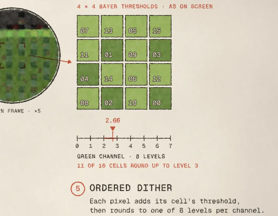
- The block. The loupe brackets one real 4×4 block of dither cells on the green enamel, from a frozen frame of the footage.
- The matrix. An arrow carries it to the matrix, drawn as the ranks sit on screen. WebGL counts rows from the bottom, so the on-screen order differs from the textbook one.
- The value. A red pointer sweeps to that block's actual pre-dither green value. In the final cut that's 2.675 of 7, from lamp footage frame 753, 0.8 seconds into the pass.
- The flip. The cells that round up flip in rank order. With 0.675 of a level to spare, every cell whose threshold is at least 0.325 rounds up: ranks 5 through 15, so 11 of 16 cells round up to level 3.
The check that matters: running the shader's maths on the pre-dither pass reproduces every one of the 16 dithered pixels. And because those numbers belong to one specific frame, they changed whenever the timing did. Each time the scenes were retimed and the footage re-rendered, the block was picked again and re-verified:
| Version | Green value (of 7) | Cells that round up |
|---|---|---|
| Print v1 | 4.47 | 8 of 16, to level 5 |
| v3 | 2.67 | 11 of 16, to level 3 |
| v4 | 2.65 | 10 of 16, to level 3 |
| v5 | 2.66 | 11 of 16, to level 3 |
| Lamp retime, first pick | 2.666 | 11 of 16, to level 3 |
| Final (after one more trim) | 2.675 | 11 of 16, to level 3 |
The last two rows came from a single morning. I asked for the lamp passes to move faster, which shifted the clock, so the block was re-picked; one more trim meant re-picking it again. The texture loupe moved too, to frame 508. A diagram that's right in one version and quietly wrong in the next would have been the easiest mistake in the whole project to make.
The Stack, the Pennant and the Organizer
Fig 5.8: the layer stack
All seven passes stack up as tilted cards, in printing order, with cyan dashed registration lines through the matching corners to show they share one frame. My note on the first version was that the cards were too crisp and simply matched the background. Now each card's face carries a small plate of its own technique (a gradient, a highlight band, a nearest-neighbour mosaic, a real Bayer pattern, a snapped grid, the artwork green), each card sits at 90% opacity so the passes below show through, and the outlines run through the same ink shader as every other line.
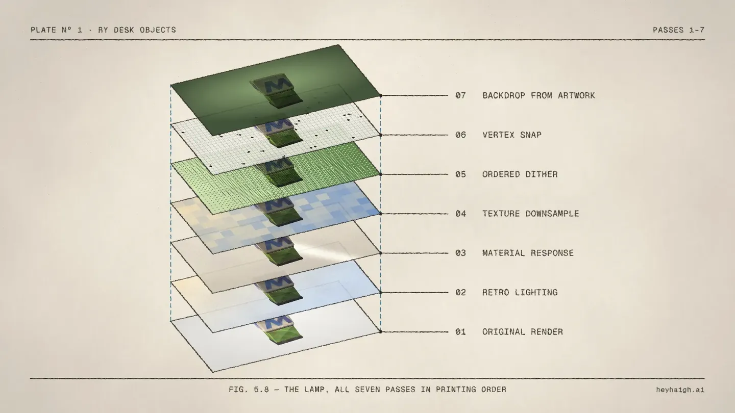
Fig 6: the pennant
The pennant is 100 triangles of felt, binding and ties. It doesn't snap. Instead, each vertex is pushed by a shared world-space sine field, so adjacent edges stay joined. As shipped, the motion is 0.006 × the model's size per axis (under 0.6%), and reduced motion turns it off. That's too small to see in a video, so the scene ramps it to ×6 to demonstrate, with a cyan sine diagram and an amplitude mark that shrink back to the shipped value in sync with the footage.
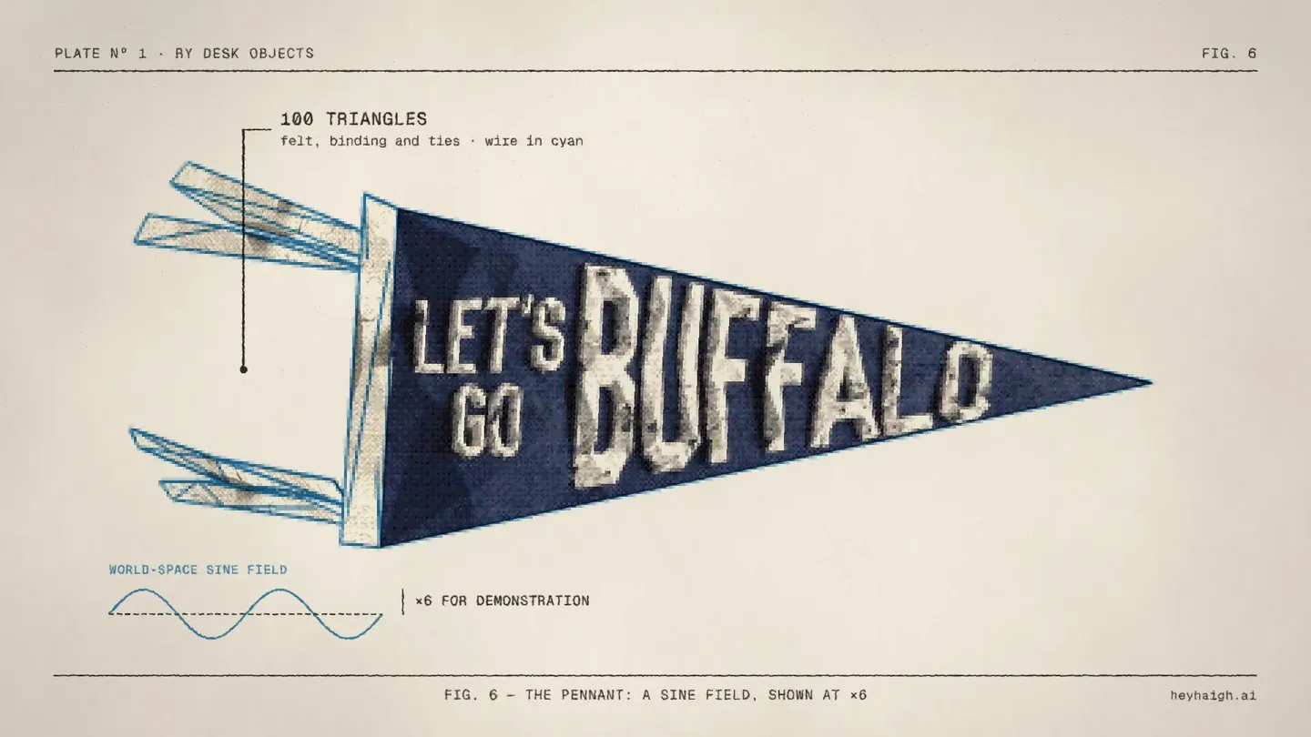
Fig 7: the organizer
A divider sweeps across the organizer from before to after. The BEFORE label in the corner is revealed as AFTER by mattes that follow the divider, so both words share one spot. My note on the first version was that the lone gold-trim callout felt lonely and off-centre. Now the organizer is centred, and it has two callouts with real values from the viewer: gold trim (metalness .55, roughness .32) and stone fascia (roughness .58, specular .55).
Then I asked for one experiment: print the backdrop the site computes for the organizer, #D7D1CC, behind it. It grows in just after the two callouts, a silhouette matte keeps the organizer in front, and the scene holds a beat before moving on.
The Mark: From Sketch to Surface
The site's end card is my yellow 3D hand spinning on black. I wanted it to start life on the page instead, as a retro line sketch, and become the 3D hand. That took the most rounds of anything in the video.
- Traced, not drawn by hand. A Python script traces the hand's outline from every frame of the real spinning render (Pillow and scikit-image find the contours) and draws them as a single line-art clip in the house line weight.
- One drawing, start to finish. An earlier version drew a vector sketch and then cut to a traced spin. It showed: the two had different line weights, and the first lingered as a double image. Now one clip draws itself on and then spins, so the drawing you watch appear is the drawing that turns.
- It spins mid-draw. I first asked for the spin to start the instant the drawing finished. Watching it, I sent a screenshot of the exact moment it should go: the index finger's top just drawn, the thumb loop closed. That's 56% of the outline, at 1.0 seconds. The rest of the line resolves while it turns.
- Frame-matched handoff. The line art spins on the same clock as the 3D render: three turns, a quartic ease-out, 6.75 seconds. Mid-turn, black ink floods out from the hand, and the 3D hand takes over inside the flood at the same pose, finishes its last turn and lands.
- A 1-2 to finish. "heyhaigh.ai" shuffles in as the hand comes to rest, then "This video was made with Tesseract" fades in right behind it, beside a Tesseract badge whose ring is at 15% opacity.
Line quality took two passes too. I asked for some fuzzy motion in the lines, then decided the first try was too rough. The weight and look should match every other line in the video, with just a tiny bit of life. The final lines use the same ink shader as everything else, plus a boil of under a pixel.
The Paper and Ink Shaders
Paper's shaders appear in one place: its HalftoneCmyk and PaperTexture shaders made the printed photos in Fig 1. Everything else in the paper and ink look comes from five custom WGSL shaders, written for this film and attached to layers as effects, each with named slider parameters so they stay adjustable in the project:
| Shader | What it does |
|---|---|
paper | Uncoated cream stock: broad mottling, short fibres in a few directions, rare dark flecks and a soft falloff toward the sheet's edges. |
ink | Makes vector lines and type read as pressed ink: a noise field wobbles the edges, ink spreads slightly into the fibres, and density varies as if pressed by hand. |
boil | Stop-motion shimmer for magnified footage and the hand sketch: small cells re-settle a few times a second. |
cmyk | A four-ink halftone with each screen at its own angle, for the Higgsfield recording. It only prints where the layer has content. |
halftone | A single-ink halftone, used for the first black-and-white style frames of the process chapter, before the CMYK versions replaced them. |
Here's the heart of the ink shader, the part that turns a clean vector edge into something printed:
// roughen edges: jitter the sample position by a small noise field
let j = vec2<f32>(vnoise(px / 3.0), vnoise(px / 3.0 + vec2<f32>(19.0, 7.0))) - vec2<f32>(0.5, 0.5);
let suv = uv + j * params.roughness / dims;
// slight spread of ink into the fibres, then uneven density, as if pressed by hand
let inked = mix(c, max(c, n * 0.9), 0.5);
let d = mix(1.0 - params.density, 1.0, vnoise(px / 9.0) * 0.6 + vnoise(px / 2.5) * 0.4);
return inked * d;
A light grain adjustment sits over the whole page and stops the moment the black flood completes, so the end card is clean black.
Sound, Placed From the Keyframes
Once the picture was approved, I asked whether we could add sound effects. We started with a test on the title card: the headline's scramble should sound like a split-flap departures board, and each line of small type like a typewriter key. It worked so well that it had to go in every scene, or the title would feel odd on its own. So we went scene by scene, on the same isolated-preview loop as the picture, until all eleven scene tracks were approved.
- Synthesised, not sampled. A small Python engine makes each sound from filtered noise and decaying tones: a split-flap card (a release tick, then the card landing a few milliseconds later), a typewriter strike (key click, typebar slap, carriage body, key return), a pencil on paper, a quick paper swipe, scissors, a rubber stamp, airy whooshes and a tiny tick.
- Placed from the animation itself. A script reads the built document and turns its keyframes into events in master time. Every text-shuffle step gets a key strike, a print dropping onto the page gets a swipe, and a line drawing on gets a pencil whose loudness follows the stroke's speed, taken from its eased trim curve.
- Sound follows type size. The title headline gets the full split-flap clatter, mid-size headings (24–30 pt) a softer split-flap, and body-size type the soft typewriter keys.
- Each figure gets its own vocabulary. In the lamp chapter, the pass changes themselves are silent: a print-roller crackle was tried and cut. Loupe zoom-ins get a faint, short whoosh, the backdrop circle a longer whoosh spanning its draw, and the Bayer squares pop in, then tick one by one as each rounds up. Elsewhere, scissors follow the cut lines in Fig 2 and a stamp lands on the Plnty badge; each card in the stack arrives with its own paper swipe; the pennant's wave gets a faint downward whoosh as it settles from ×6 to the shipped amplitude; and a long, gentle whoosh travels with the organizer's before-and-after wipe.
- The end card took the most tries. The sketch gets a graphite sound that follows the pen. As plain pencil it was too quiet, and 12 dB louder it was too crunchy. The approved version sits 15 dB under that loud one, with much less grit. The spin gets a whoosh each half-turn, fading as it slows, there's a low ink bloom under the flood, the domain lands with a split-flap, and the credit is left silent.
- Calibrated to the approved title. The title's levels are the reference. I asked twice for the CONTENTS and FIG lines to come down, and they settled 10 dB below the subtitle's keys. Every other scene's sounds are scaled to those, so a soft key in Fig 6 is exactly as loud as one on the title.
- My ears, not Claude's. Claude can't listen to audio. It can place a sound on the right frame, measure levels and check nothing clips, but whether paper sounds like paper is my call.
Fig 1 shows how that plays out. It took five previews, each about 20 seconds to export:
- v1 placed a paper slap and two tape presses as each print landed.
- v2: I asked for subtle paper-shift sounds under the two photos, so a soft rustle was added to each drop.
- v3: I said the photo sounds read like more typing. They did: the short clicks overlapped the header and caption typing in. The clicks went, replaced by one continuous paper slide that was also loud enough to hear.
- v4: I said it should be more "shht shht" than a rustle. Each photo now gets one crisp swipe, about 0.17 seconds, that swells fast and stops short as the print lands.
- v5 and after: "That new SFX works great! Let's just lower the dB −10." Then 5 dB more, so the swipe settled 15 dB below the first "shht", with nothing else changed.
Every scene was designed, previewed and approved on its own, and the master was recut once, only after all of them were signed off. Approved tracks were then locked. When the transition trims moved scenes earlier, nothing was regenerated: each track's start time was shifted by exactly as much as its scene moved.
Debugging Lessons
A few of these cost a round each. They're worth knowing if you drive Tesseract from code.
Stroke opacity is 0–1, and colour alpha is ignored
The Tesseract badge's ring stayed solid when it should have been faint. Setting the stroke colour's alpha did nothing, and setting stroke opacity to 15 was clamped to fully opaque. Stroke opacity takes a 0–1 value, so the fix was 0.15. It took two tries.
Easing lives on the destination keyframe
A keyframe's easing describes how the value arrives at it, not how it leaves. The tool that later reads the document's own animation for sound effects relies on that: a motion segment counts only when the keyframe it ends on isn't a hold.
Keyframe times are local to the layer
A fade keyed in scene time on a layer that started later was simply invisible. Every keyframe time is relative to its own layer's start.
Smaller ones
- Transparency. HEVC alpha was ignored, and ProRes 4444 alpha worked but cost about 130 MB per 3 seconds. Rendering on white and multiplying onto the paper needed no alpha at all.
- The CMYK shader painted the whole frame. It printed paper everywhere, including where the layer was empty. It now checks alpha first and only prints where there's content.
- Tape that floated. The strips rotated around a corner, so they looked detached. Each strip now pivots on its centre, half on the print and half on the page.
- Orphan keyframes for layers the builder had filtered out made the apply step fail, so actions are now filtered to the layers that exist.
- A white flash on a fade. Fig 4 flashed white as it faded in and out. Its footage is rendered on white and multiplied onto the paper, but the scene group around it blended normally, so the white showed while the group was partly transparent. Setting the group itself to multiply fixed it. The flash had been in the fifth master too. Every other scene fade was then measured, and none of them flashed.
What I'd Keep for the Next One
- Every mark points at something real. It was a style rule, and it turned into an accuracy rule. Once every arrow had to end on a true thing, the Bayer matrix had to be verified, the callout values had to come from the code, and the loupes had to be measured.
- Use the real producer. Rendering the passes with the site's own shader code made the video both accurate and easy to change. A recreation would have drifted.
- Approve looks with stills, timing with frame strips, motion with isolated scenes, and export last. The difference between a 20-second scene preview and a 100-minute export is the difference between ten rounds of notes and two.
- Keep the document editable. Because the builder writes native layers, every note was a small code change and a rebuild, never a re-edit.
It's also the most fun I've had directing something I didn't touch with a mouse. The desk objects are live on the homepage. Open the lamp and look closely at the green enamel. Now you know what those dots are doing.
Try It Yourself
If this made you want to direct a video of your own, start with Tesseract by Mirage. I used it from both ends: ChatGPT has a Tesseract plugin, and in Claude Code I worked through its skills and command-line tool.
The easiest way in is to let the agent set it up. Paste this prompt into ChatGPT or Claude (Claude Code included) and the agent checks your environment, installs Tesseract itself and renders a test preview before asking what you want to make:
Set up Tesseract by Mirage so you can create editable designs, edit videos, and make motion graphics in this agent’s environment. Read https://github.com/mirage-hq/Tesseract and check the requirements for this local or hosted environment. If it is supported, follow the official plugin or skills installation guide, use its required runtime version, verify the download checksum, and confirm a short preview renders correctly. Then ask what I want to make and which brand references or source assets I have. Keep the editable project and source assets with the finished render.From there, the workflow in this article is the part I'd copy: bring real assets, approve style frames before anything moves, review on contact sheets and frame strips, and preview scene by scene before the one long export.
Make something with Tesseract
Editable designs, video edits and motion graphics, built by the agent you already use.
FAQ
Was this video AI-generated?
No footage was generated for the video itself. The photos are mine, the 3D passes are renders from my site's own viewer code, and the 3D models came from my earlier Plnty and Higgsfield process, which the video documents. Claude Code wrote the Python that built the Tesseract project, plus the shaders and sound engine. I directed every change.
What is Mirage Tesseract?
A motion editor from Mirage designed for agents. Projects are editable documents that an agent can build and change through skills and a local command-line tool, then preview and export. Here it handled compositing, text, shapes, mattes, custom WGSL shaders and audio layers.
How do I get Tesseract?
Start at mirage.app/tesseract. Or paste the setup prompt from Try It Yourself into ChatGPT or Claude and let the agent install it and render a test preview for you.
Is the Bayer dither in the video exactly what the site does?
Yes. The matrix, threshold and 8-level rounding come from the site's fragment shader, and the block shown in the video was checked by re-running that maths on the pre-dither render: it reproduces all 16 dithered pixels.
How long did it take?
The print edition went from first style frames to the approved master over a long day, an evening and the next day, across six versions. The last two 1080p exports took 1 hour 40 minutes and 1 hour 7 minutes, and the 4K master 1 hour 45 minutes, which is why almost all review happened on contact sheets, frame strips and single-scene previews.
Can I see the 3D objects themselves?
They're on the desk on heyhaigh.ai. Click the lamp, the organizer or the pennant to open each one in its viewer.